The 10 Commandments of Good Design: Dieter Rams
1. Good Design Is Innovative:
This means that your product/design should be able to give other people fresh and new ideas and opportunities, it shouldn’t be a copy from an existing design, it should be fresh and inspiring.
2. Good Design makes a product useful:
A good design would be made to serve a purpose, and be useful in someway, be that a practical manner, or simply to be inspiring/imaginative.
the design or product must be created to serve a purpose.
3. Good Design is aesthetic:
A good design must be aesthetically pleasing, this means that it must make people want to look at it or touch it. However it must be pleasing for the purpose it has been given, be that pleasing to hear, touch or to look at.
4. Good Design helps a product be understood:
Basically, a good design means that when people look at it for the first time, the instantly know what’s going on, they wouldn’t need to ask any simple questions just to find out what the product/design will do.
5. Good Design is unobtrusive:
The main product that comes under the term “unobtrusive” are tools, because they are neither for decoration or works of art, they are simply tools you use to get a job done.
6. Good Design is honest:
A good design must not be false in the sense that you see a design and from that you can see it having various aspects to it and that is why you like the design so much, however that isn’t true at all, and the design has tricked you into thinking those things. This would make you feel cheated and a good design would never do that.
7. Good Design is durable:
Everyone wants something that can last, so a good design should be able to withstand daily use/life for a long period of time before it may need slight adjusting, good design shouldn’t break after the first time you use it, otherwise it wouldn’t be good design.
8. Good Design is thorough to the last detail:
This means that if you were to invest in a product that hasn’t been created yet, and all you could see were the designs, you would want to know every detail about that design before investing. So if you were to invest and the product turned out different to than the design stated, then this wouldn’t be a good design. Good designs are detailed and let you know every aspect of what may be going into that product.
9. Good Design is concerned with environment:
In the modern age more and more companies are trying to be environmentally friendly, so a good design for the modern age should adhere to this. Using raw materials would cause pollution as well as destruction to the environment, good design would try to avoid this.
10. Good Design is as little design as possible:
Although good designs do need to be detailed and thorough, they shouldn’t be too complex because they still need to be understandable. So a simple yet effective design is always much better than an overcomplicated design.
——————————————————————————————————————————————–
Within this Typography brief we need to trace lettering from various sources and apply them to the poem, ‘Do Not Go Gentle Into That Good Night” by Dylan Thomas.
Firstly we needed to take all of the formal rules into consideration:
“Kerning” which is the space between words that sit next to each other,
“Tracking” which is space between the individual letters,
“Leading” which is space between the lines of text.
Once we had completed the first stanza with these rules in mind, we were then allowed to break the rules and have fun with the text design.
I however, didn’t read this properly and jumped straight in instead. So I have done the first line, rather than the first stanza with these formal rules in mind and gone hell for leather on the rest, but also, if you read on through the brief it says that the rest of the poem can be done by tracing the letters, or digitally. I did not read this, so my whole book was done by tracing lettering that I had done digitally.
I NEVER want to trace a single thing ever again.
——————————————————————————————————————————————–


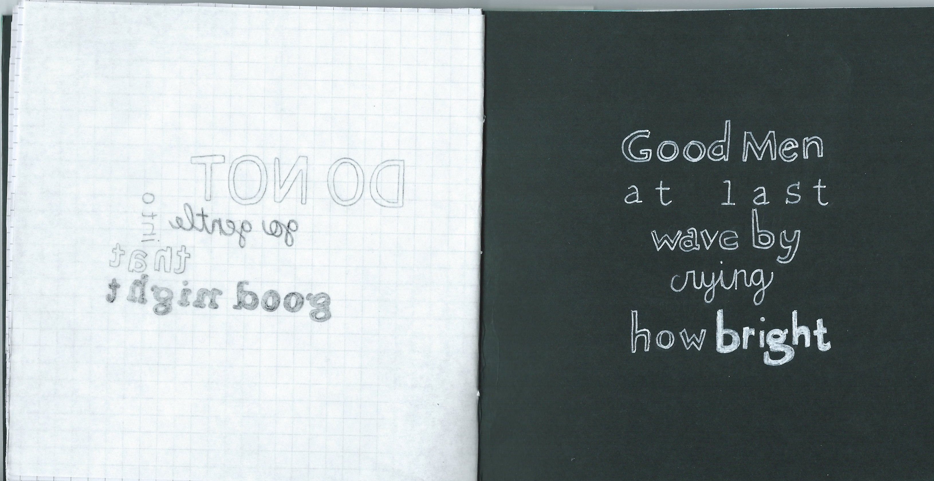


Above are a few pages out of the book that I created for this brief. Although I have finished the brief I am unhappy with the outcome. I don’t like the amount of white space that I’ve left within the book as well as the layout of text within the book so I have decided to re-do this brief.
I intend to do a series of post card sized graphical and typographical images that illustrate the poem. I believe that this will work a lot better than the book.
——————————————————————————————————————————————–

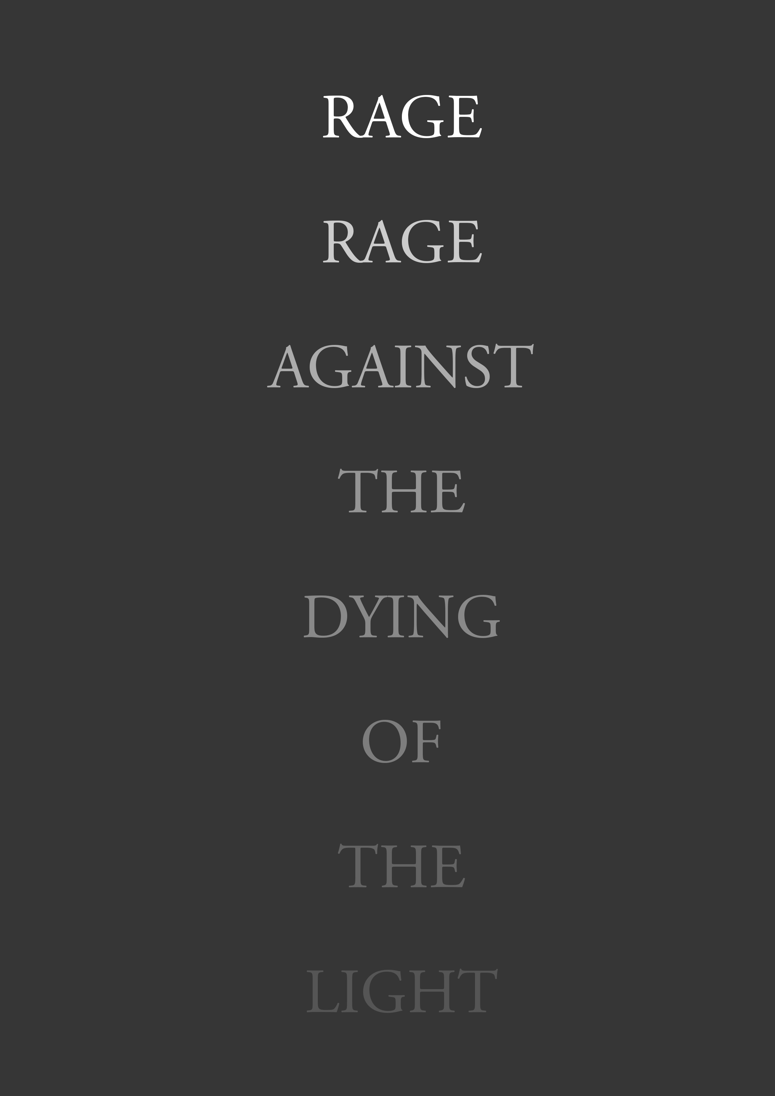


I decided to make a few new postcard sized images illustrating the text from the poem. I wanted to play around a bit more with these, I do prefer these more than the book, but the book did influence a few of them so I couldn’t have done them without it.
I think my favourite one would be the one on the far right. I like the use of mirrored text and then having that grey band of text though the centre. I also like the second from the left. It is very simple but I like how the text fades into the background, it also relates to the text itself which adds more meaning to it.
——————————————————————————————————————————————–
http://www.designsojourn.com/dieter-rams-and-his-10-design-commandments/
