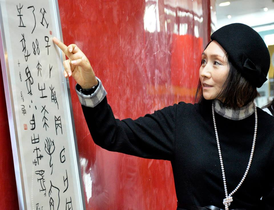


On Monday the 29th of September we went to the Confuscius Institute at Bangor University for a lecture and a workshop on Chinese Calligraphy.
It was a very interesting day, we were given a lecture by a woman named Sun He, I learnt a lot about the history of Chinese Calligraphy and how the symbols used were developed and changed over time. I really enjoyed the workshop and being able to use the Calligraphy brushes, I wasn’t very good but I’ll get there!
Upon getting back to college we were given a brief to go along with the workshop that we had just taken. We were to continue practicing our calligraphy and research into Sun He’s work and other Chinese calligraphy symbols.
We are to work with Illustrator to generate a piece of work that is inspired by Sun He’s work, we’re going to be using graphics tablets to develop our work which would be a complete contrast to the ink and brushes commonly used.
We are then to develop our ideas into our own individual pieces of work, the aim is to show the beauty of traditional Chinese Calligraphy whilst adding a contemporary twist.


Above: images taken from sketchbook.
So after researching into various other Calligraphy images I have decided that I want to do two images. I want to use an image of the lamb that I have hand reared and tell the story of his life through the Calligraphy.
I also want to use an image of myself and my boyfriend and have the words ‘I love you’ down one side of the image. I want to use this because I like the way Calligraphy is quite romantic in the sense that love is blind, because unless you can read the Chinese Calligraphy you don’t know what it says, but pair it with a particular image and you would be able to understand it.


So after deciding on the images that I want to use I decided to edit the images in a way that makes them incredibly light, I wanted this because I knew that I wanted to draw the Calligraphy in black because it was traditional, so I wanted it to be bold and I didn’t want it to get lost with the image behind it.
I wanted to have the traditional black Calligraphy because I wanted there to be a visible contrast between the Calligraphy and the digital images that they were combined with.

This is one of the final images, I’d found a calligraphy brush within the software ‘Adobe Illustrator’ so was very happy with the way the calligraphy had turned out.
——————————————————————————————————————————————–
I decided to do some more Calligraphy images, simple but effective ones using Photography of mine that I’d previously taken. The captions on the images are simple quotes which link to the images.
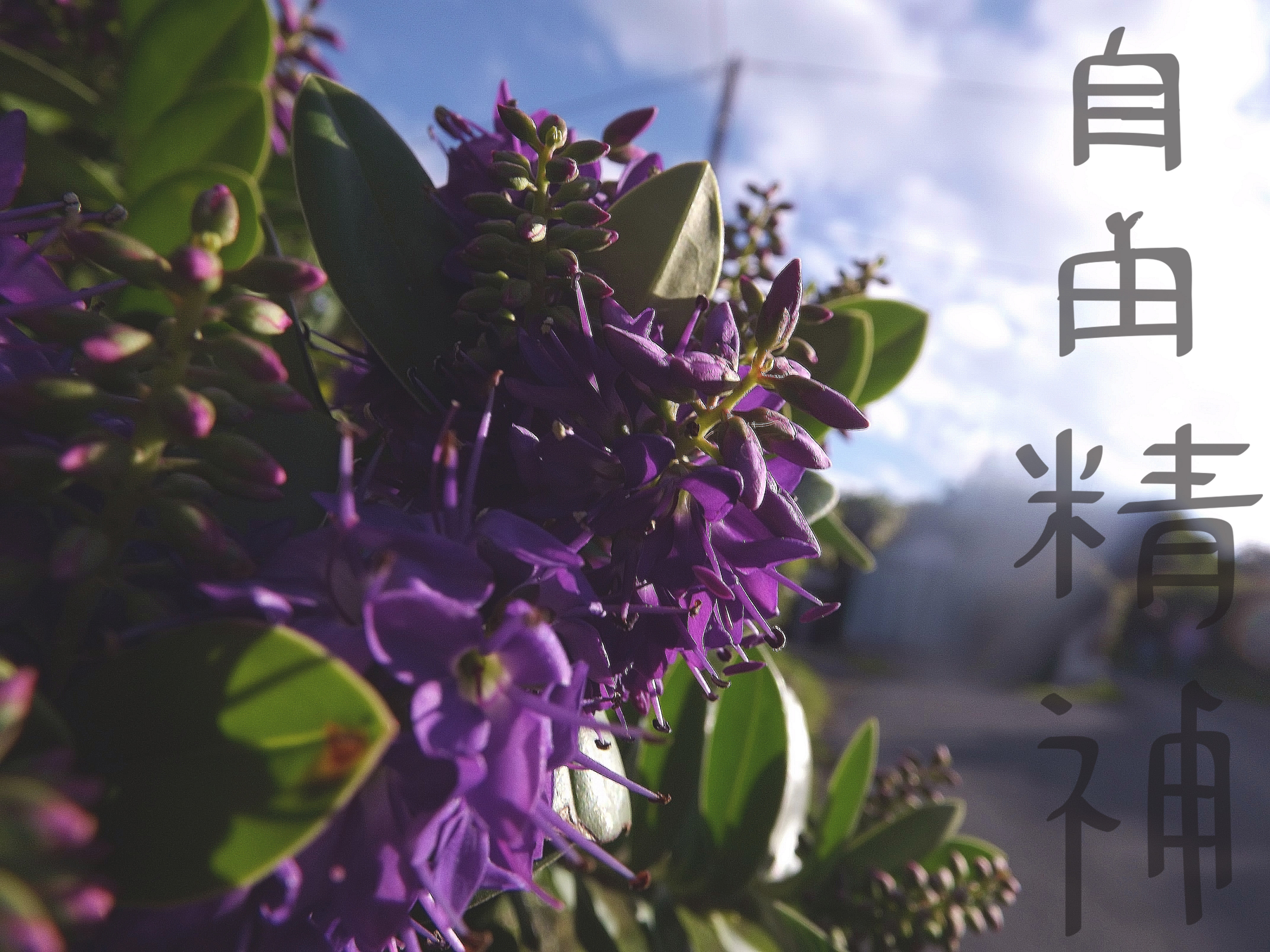


I am very happy with these images. I experimented with having the text through the centre of some images and changing the Calligraphy from the traditional black to white, and I think that the white works very well. I did however usually keep the Calligraphy vertical because that how you read it, however on two images I had it horizontal, but I do feel that it works better vertical.
——————————————————————————————————————————————–
Link to online Chinese dictionary: http://www.nciku.com
Link to Chinese Calligraphy: http://www.learnchineseez.com/characters
