
So on the 22nd of September we went off to Llandudno for the Mostyn Gallery and Llawn 2 , it was a very interesting, but also very depressing day for me. The exhibitions at The Mostyn Gallery were all based around War, and the imagery used to illustrate that were incredibly powerful.
Broomberg and Chanarin, had created three exhibitions named, ‘The Day Nobody Died’, ‘The Afterlife’ and ‘Divine Violence’. (http://www.choppedliver.info)
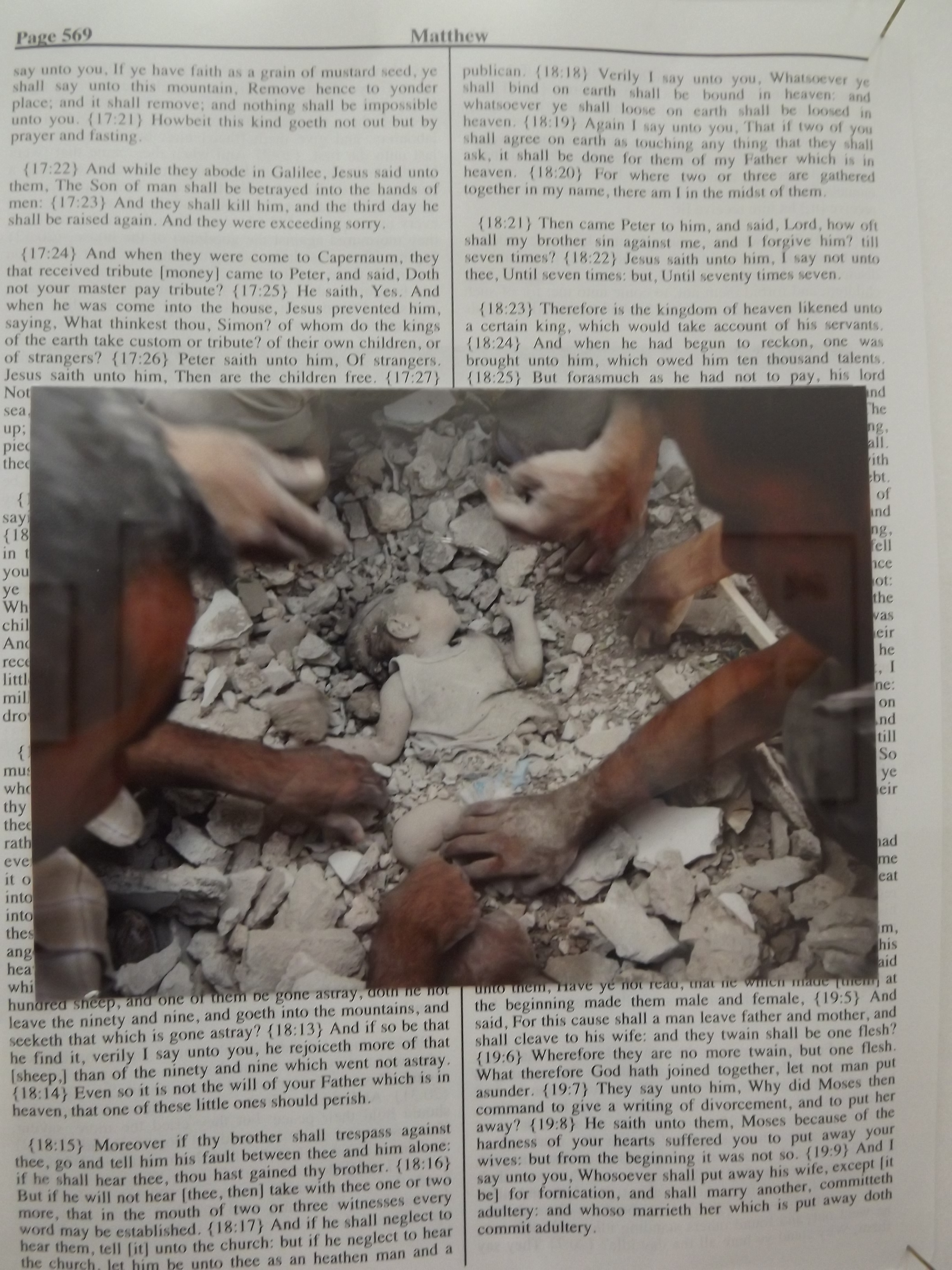
Divine Violence was a selection of images chosen to pair up with pages from a Bible, the images were all based around war, death and pain, chosen from a specific archive in London. I found this quite disturbing because, The Bible is usually interpreted to be peaceful and with messages about how to be a good human being, and having that many images of death and pain in such a small area overwhelmed me greatly. I felt a great sadness seeing these images and walking around the room, seeing exploding bombs, dead children and deformed bodies. It made me realise how fragile humans really are. We as a species are dominant over any other, but that is only because we have a superior mind. There are many other species that can overpower us, but because we have the mind and the skill to create horrific weapons, we force ourselves to be dominant. Which is the only way we have survived.


‘The Day Nobody Died’ was an exhibition where Broomberg and Chanarin took two huge rolls of photographic paper out to Afghanistan on the front line with the soldiers, and the images that they took each day were distroyed at the end of the day. Broomberg and Chanarin were intrigued by the conversation around an image, so each day out in Afghanistan they would take the photographic paper out and expose a section of it to the sun for a certain amount of time. This created an unusual pattern along the paper.


We were spoken to by a member of staff at The Mostyn Gallery who spoke to us about each piece and she mentioned when Broomberg and Chanarin came to set up the exhibition and they asked the members of staff what they thought of these images, and someone used the word “beautiful” to describe them which apparently the two men shudder, because if you look deeper into these images they are anything but beautiful, and that is what these men wanted people to do. There were mark and scrapes on them which just shows where these pieces have come from, the Kodak logo had burnt through onto the front of the pieces because of how hot it was out in Afghanistan, so for someone to describe them as beautiful is quite lackadaisical because they haven’t put the effort in to look beyond the colours and patterns that are so obvious with these images, and see the meaning behind them.


‘The Afterlife’ was the exhibition that I mainly focused on because it made me feel the most. I felt so desperately saddened by these images. The fear and sadness that these people were feeling, the pain that their families must have gone through. Being blindfolded takes away an incredibly important sense, and without it they must have been crippled with fear.
The photographs were taken by a man named Jahangir Razmi in Iran on 6 August 1979, the men in the photos were Kurdish prisoners, and the photographs document their execution. However, Broomberg and Chanarin had cut the images up and singled out people. They put images of them on individual frames, which gives the viewer a before, during and after insight into the executions.
The member of staff from Mostyn Gallery also spoke to us about this piece, she mentioned that the shadows cast on the wall behind by not having a background to these images, looked like figures being hung by the neck, and to me this seems to show that these men were dead before the shots were even fired.
I would like to use the idea of hanging as well as the clear glass element within my own work. I want to use ‘The Hanging Tree’ song from The Hunger Games as a basis for the work because it is quite a powerful piece of text, and then gather images which relate back to that piece of text.
The work is supposed to be experimental so I am going to play with elements such as having the bodies with a calming or happy background, to give the idea that some people can face the situations that they are put in calmly, for example if they believe that they will be going into heaven. So I will be experimenting with various elements of it and seeing which ideas work better than others.
——————————————————————————————————————————————–
Continuing with the work…

I began this series of postcards by researching the song that I decided to use from The Hunger Games. The song is called ‘The Hanging Tree’ and it is a very powerful song. When you initially read the lyrics you seem to think that the man is telling his lover to flee so that she is safe, however throughout the song he seems to be calling her to the tree where he has been hung, so you can be in two minds about whether he is trying to tell his lover to flee to safety, or to come to the tree and be with him instead.
Once I had the lyrics I printed them out onto card and cut them out into the appropriate sizes. I then started to look for images which I wanted to use for these pieces. Within ‘The Afterlife’ exhibition there were small cuts of photographs that were images of the sky so I knew that I wanted to incorporate that in there some how. I used an image that I had taken from the ‘Divine Violence’ exhibition of the man with his back turned towards you because the image was very striking and fit in so well with the piece of text. I then went on to look at war photographers, there was a book on Don Mccullin in the library, and looking through that I found an image of a corps at the base of a tree which also seemed to fit the piece of text, so I decided to use that image. Online research brought me to a website (http://www.fiero.nl/cgi-bin/fiero/pdaShowThread.cgi?forum=6&thread=093275) which is host to horrific war images, and last image in this series was of the body of a man being hung from a tree whilst another man went to beat him with a chair. I found this images to be very disturbing. I could hardly look at it, but I knew that this image was very powerful and an important piece of history. I decided to use only the tree from that image because of how graphic and brutal it was, however I left the shadow of the man by the tree as a reminder that he was there.

Once I had finished the series of 4 postcards I then went on to experiment with other images and ideas.
The first image from the left was of an anonymous soldier, I decided to cut out his face and add smoke into the background to illustrate how so many of these brave men that put their lives on the line for their country are simply forgotten.
The second and third images are connected in the sense that I cut out the group of soldiers from one image, and used both positive and negative parts of the image for different pieces. I wanted to illustrate again how some men are remembered and taught about in schools, whilst others are forgotten.
To be quite honest I don’t really know what I was doing with the final image. I wanted to try and take the image of two soldiers away from the brutality of war and the fear and anxiety that goes with it, and put them somewhere safer. I don’t think that I have illustrated that very well here, however I do like the contrast between the red flowers in the background and the black and white image of the two men.
——————————————————————————————————————————————–
I have just been looking through a book called, ‘All Messed Up – Unpredictable Graphics’ by Anna Gerber, and found this double page spread.

This image caught my eye because of the layering involved. The way it looks quite rugged and thrown together, the way the ink has smudged in some places and the faded parts of the images. I want to use found images and the elements of faded ink and the image just being worn down and used within my own work.
——————————————————————————————————————————————–
So last night I was working on these two pieces:


The one on the left was inspired by the layering of the double page spread I spoke about before. However it didn’t go to plan, I think that the tracing paper was too opaque for some images behind to show through. You are able to see maybe three layers behind relatively clearly, but after that you can see a blur of one and then nothing at all from the final layer. I really dislike the way the pages have wrinkled from the glue and it looks very unfinished and, just awful. I was however, very pleased to find out that I can actually print onto tracing paper! I think this piece is the definition of experimental.
The image on the right came from me listening to music whilst working, the lyric was “I’ve told you before you’re my little soldier” and this made me think of how parents will call their children brave little soldiers, but then fret about if they actually want to become soldiers. So I’ve mocked up an image because I was pushed for time, in the background there is a sort of timeline of a boys life, from birth, to playing football as a child to having a girlfriend to just growing older. I put these images in black and white and lowered their opacity so you could barley see them. I then added an image of a British soldier’s coffin over the top. I lowered the opacity of this image a swell so that you could see the timeline beneath. I then played with the colour levels until the red and blue of the flag were very bright and then added the text over the top. I printed the image out onto tracing paper because it’s a lot more fragile than ordinary paper and I wanted to represent how fragile human life is.
——————————————————————————————————————————————–
So after going off on my own little thing, I decided to start trying to think of a final outcome. I knew I wanted to go back to postcard size, so decided to do a spider diagram.

So I started looking at what postcard might be used for, and that they can be used for letters, to send messages back home to loved ones if you were off fighting in a war. So I started thinking of what I wanted to put on the front of these postcards and then that idea led me onto the personal possessions of the soldiers. So I decided to do a broad search of what soldiers might have with them in a war which then led me to the ‘Ditty Box’. (http://www.bbc.co.uk/ahistoryoftheworld/objects/ZGF_KfFRSRG7_qFlOCJdrQ)
I went against creating my own ditty box because I didn’t think it was very relevant to my practice and instead decided to work on illustrations of what these ditty boxes might contain. So I thought of family photographs, a pipe, a shaving kit, letters from home, a camera, glasses e.t.c. so I decided to use these 6 items as the main focal point for the postcards.
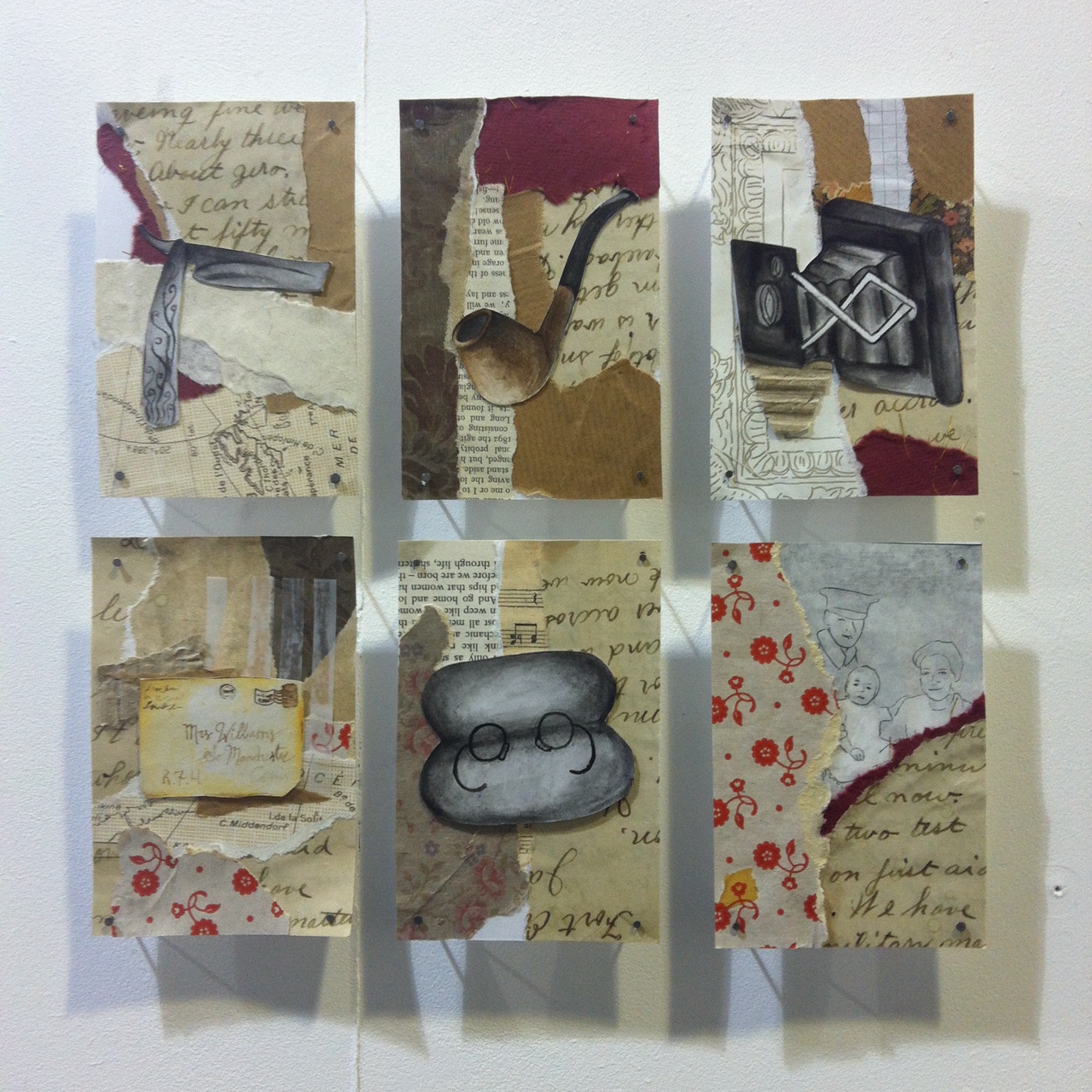
This is my final outcome for this brief. I decided to nail the postcards to the wall and to have them floating off of the wall to give them more depth and to make them an object rather than a piece of card stuck to a wall.
I am very happy with this final outcome. I used similar materials throughout each postcard so they look like a matching set which is what I wanted initially. I printed out a letter from World War 1 and ripped it up and used that within each postcard because a letter is a very personal item, it is your feelings and thoughts on a piece of paper that anyone can read, so I wanted to take that personal element and put it with these pieces because they would have been very personal to the people that were using them. The soldiers would have been in an unfamiliar place and these few items would have been the only things they had of home.
——————————————————————————————————————————————–
Link to Broomberg and Chanarin’s website: http://www.choppedliver.info
Link to online research: http://www.fiero.nl/cgi-bin/fiero/pdaShowThread.cgi?forum=6&thread=093275
‘All Messed Up’ – Unpredictable Graphics’ by Anna Gerber
Link to information about Ditty Box: http://www.bbc.co.uk/ahistoryoftheworld/objects/ZGF_KfFRSRG7_qFlOCJdrQ
