For our next project we are entering the D&AD New Blood competition. We are able to choose from any of the competition briefs that we like and I am VERY excited to start!
The briefs this year are all really good! There were a few I was stuck between, however in the end I have decided to choose the i-d brief! It’s about looking at a subculture of society and trying to capture the essence of it within three images.
“Originate, Don’t Imitate.”
Entering the New Blood Awards is really exciting because there are so many amazing artists involved. I’m excited to get started and choose my subculture and generate ideas for this brief.
——————————————————————————————————————————————–
So I’ve finally decided to look at the bibliophiles of my generation as my subculture. I decided this because I adore reading and I was on tumblr at the time where I follow a lot of book related blogs, and I talk to a few of them regularly so I thought that this would be the perfect subculture for me.
So I began by asking three of the book blogs that I follow if they would mind me using their photographs as inspiration for illustrations that I wanted to create for this competition. They all agreed which was great! and I began work on an image, got about half way through and we had a crit.
Where by reading the brief again you see “These must be single images, not collages or composites”. Which makes the image that I’d been working on irrelevant. I was however quite pleased about this (but lets keep that between you and I) because I had become very frustrated with the image and wasn’t enjoying it. So now that I know I’m going to be putting on a photoshoot! I have very happy! It should be really fun!
——————————————————————————————————————————————–
I started researching into some Photographers because I’m still undecided whether I want to have a staged photoshoot with props and costumes and makeup, or whether I want “in the moment” images to capture people as they are.
Annie Leibovits:


These are images from staged photoshoots which I find incredibly beautiful. Annie Leibovits works with a HELL OF A LOT of big name celebrities, which is amazing.
The lighting in both images works really well and highlights the models really well, the models are clearly the main focus of the image.
Tim Walker:


These images are incredibly beautiful but others that he has taken tend to get rather dark and creepy! The composition of these images works really well because the models are the main focus again, and with the left image the space around the model is even so your eyes are drawn to her.
Costumes and makeup are also beautifully done and have an incredible fantasy look to them.
Sophie Ebrard:


These photographs by Sophie Ebrard are much more natural than the other images I’ve looked at. I like the natural surroundings and the lack of props and makeup and costumes involved.
The images are flooded with light which makes them captivating. What I like about these types of images are that you are getting more of the person in the images, you see their messy hair and their makeup-less faces and you seem to get more out of the images.
——————————————————————————————————————————————–
I definitely see the positives with using more natural images for my work. However after purchasing a copy of the most recent issue of i-d magazine, the images within are staged.
Although, within the beauty issue that I purchased, there is an emphasis on natural skin and that beauty is only skin deep. So I begin to wonder whether images of natural people, being themselves would be published within the magazine. I believe that if I take the images well enough then they probably would be? i-d is about fashion and culture and style so as long as I incorporate those elements into my work I should be good to go!
——————————————————————————————————————————————–
I went out with a friend to take some images for this project, and the day started off badly to say the least, I needed new batteries for my camera, so after going for them we decided to go to lunch, which was a great idea! took a beautiful image in the restaurant, we then went around Bangor to take more images, I failed to take some due to my lack of skill in Photography, so we decided to bail the project, and go shopping instead. Not the best plan for the project, but I had fun!


On top of that, when my boyfriend and I went to take some more images for this project, I had forgotten my SD card so that had to be abandoned as well! No problem though! I have plenty of time left. I intend on going out next week to take some more images, but I have a work placement so we shall see.
——————————————————————————————————————————————–

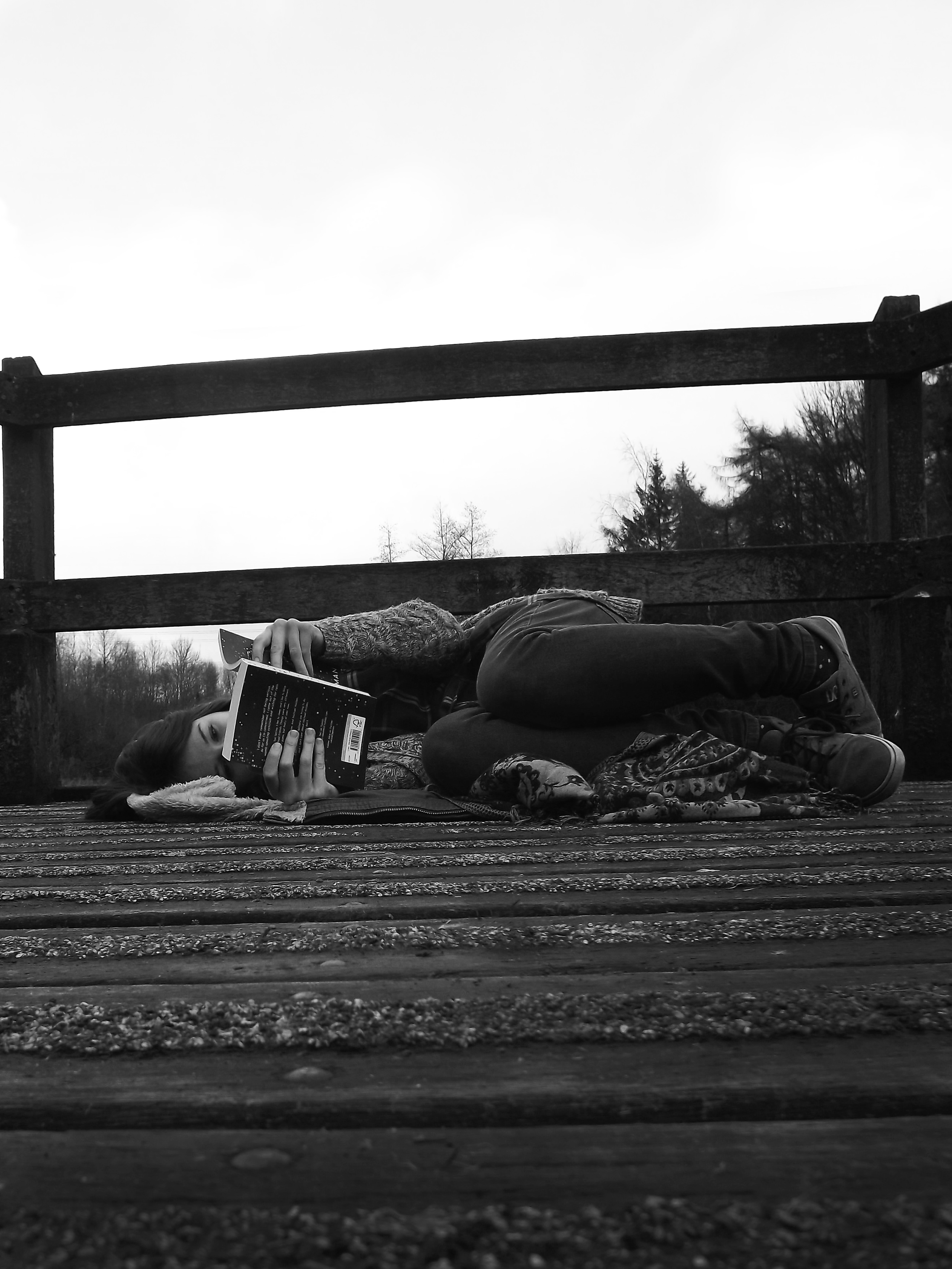
I initially took some images down by the lake at my college, and I liked the right image the most out of that set, so then I began thinking of having the set of three images, with that pose as the identifier for a theme.
However, looking at these images, I need to retake the left image because a) this is for a fashion magazine and I’m in joggers and a jumper, and b) I’m too close and not laying perfectly straight like in the other one!! Maybe I’m going too anal with this?
I am still tempted to change my whole idea, maybe have some adorable shots of myself and my cat reading! because why the hell not!?
——————————————————————————————————————————————–
——————————————————————————————————————————————–
15.02.2015
Don’t get mad! But I may have changed my brief completely… It’s for the best though!
I have decided to change to the Pantone brief, which was,
“Reimagine your town through a language of colour”.

This was my initial idea, I have no idea why though!?
I wanted to trace over images from around my town and have a simple block colour image, but using different colours that related to the town, so I was going to just use blue and yellow, but I don’t think that I could do the whole town in blue and yellow, so was thinking of adding green and grey, but variations of these colours too.
After completing this image I had no idea what it was for? I don’t think it’s interesting enough to be an advertisement, doesn’t really say anything about the town, it’s quite stale and boring. After deciding not to use this image, I had to think deeper into what I was going to do for this brief. Speaking to my friend he reminded me that we always use the website “Behance” when doing briefs like this because other people post their work and it’s good for getting inspiration.
——————————————————————————————————————————————–
https://www.behance.net/gallery/23688231/Entry-for-D-AD-Paint-Your-Town-Colorful


I really liked the logo for this work. It was simple yet conveyed the message of the work. The artist had created various pieces of stationary as well as app visuals, which is the bottom image. The app is supposed to take you through all of the secret hidden pathways through the chosen area which I think is a good idea! It lets others find all of the beautiful places that you already know about, sharing the beautiful scenery of the place you love.
——————————————————————————————————————————————–
https://www.behance.net/gallery/23089025/D-AD-Pantone-Brief-St-Ives


This piece of work was a tourist guide book for their town. I like this idea very much! Inside the booklet there was information about colours that were inspired by the town, their logo development, places to see, shop, eat and drink. There was also information about the beaches there as well as photography from the surrounding area.
To go along with the booklet there were accessories such as bags that were branded with designs relating to this booklet, as well as some promotional posters.
——————————————————————————————————————————————–
https://www.behance.net/gallery/22578581/Cheltenham-Racecourse-Pantone-D-AD-New-Blood-2015


I like this piece because of the idea behind the logo. When you first see the logo, you think that there isn’t any connection between it, and the Cheltenham Race Corse. However from a birds eye view you see that it is the outline of the perimeter of the corse.
——————————————————————————————————————————————–
https://www.behance.net/gallery/22955215/Creativity-in-Bristol-Pantone-D-AD-


This piece was related to the wasted ideas that come from Bristol. The sculpture is supposed to represent a crumpled paper ball, which represents ideas being thrown in the bin.
I prefer the idea more than the execution, I believe that sculptures are supposed to enhance the area that they are in, but all I can think of these pieces is that they’re more of an eye sore than anything.
I do however, like the face that the designer has put the pantone samples in the bottom right corner of the colours that they have chosen to use in that image.
——————————————————————————————————————————————–
16.02.2015
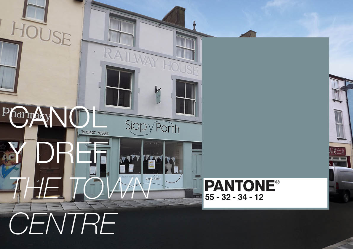
After looking at other people’s work, especially the tourist guide, I wanted to create a tourist guide for my town. It is quite a beautiful place (in the right light) and I don’t know of any existing tourist guide for the area.
I want to use photography from the surrounding areas such as the Breakwater Park, the beaches, The Nature Reserve, the mountain, the Breakwater, the Town Centre e.t.c.
I then intend to colour pick a colour or colours from that image and have a pantone sample on the page. I think that it will be interesting to see the variety of colours that there are in a town that the majority of people think is a dull place.
——————————————————————————————————————————————–
18.02.2015
After deciding on my plan, I started developing a logo, I initially wanted it to have a certain shape, be it a square, circle, or a shield shape, so I began designing logos to match that. They were awful. Each logo I made to fit inside the shape of something didn’t work out well at all, they seemed like they were trying too hard to be a logo for the town, rather than to promote the town.

On the left I have tired to use lines to represent the mountain and the sea, but had no idea what else to add in order to enhance it. So I decided to leave it and come back to it if I got any more ideas.
The logo on the right is in a shield shape, and has a line through the centre to represent the Breakwater and I have no idea what I was doing on the right had side of the logo. However they reminded me too much of my Primary School logo so decided to leave those alone.
I got rid of the idea of having the logo a certain shape, and started playing with the idea of the rare flower that grows only on Holyhead Mountain, I thought that it would be a good logo to have something as individual as that, and it could also be an attraction point, to come as see a rare flower that only grows here in the World.


Unfortunately the name of the flower is ‘Spatulate Fleawort’ not the most enticing name ever chosen? it’s also not the prettiest flower ever either.

I decided to go for a rather simple childlike logo. I simply traced the outline of a the flower and coloured it in yellow. I don’t think it is good enough to represent a town though! On the left I found a filter that would simplify an image into 16 colours and I found that rather interesting! It would make a nice advertisement.

After hitting a brick wall, I decided to made a board on Pintrest and to add all of the relevant Town/City Branding and logo designs I could to it. I found some really interesting things, a booklet for a translation grabbed my attention, the logo below on the left is pretty much the logo that they used. I thought HEY! Holyhead has a train station! I drew this shape out and then thought that I can’t simply copy their logo! so played about with composition and added lines to represent Holyhead Mountain.

I then thought that it had gotten too ‘try hard’ and wasn’t even a decent logo anyway! However playing about with the lines of the mountain in the last logo gave me an idea..

I began playing with lines to create depth for the mountain logo. Once I had a shape I was happy with I copied it three times, adding colour to two of them and keeping the last blank.
I thought that blue would be a good colour because my town is surrounded by water, but then once I’d completed that, I thought , well, mountains aren’t blue? so needed to create a green one. I kept the last one blank because I was thinking of the logo design (above) for the St. Ives town booklet, and how that is a simple outline in white, and so I wanted to do that for this logo.
I wasn’t completely sold on this idea though, and so used this mountain idea but shrunk it and added a light house on top, to represent South Stack Lighthouse. This was actually inspired by a logo I’d found on Pintrest of a fountain pen with what I interpreted as rays of light coming from it. I am happy with this logo, but am slightly on edge about whether it’s too tall or not?
——————————————————————————————————————————————–
19.02.2015
With my idea for the booklet solidified, I had a sleepless night of writing and planning in my sketchbook of page layouts and cover ideas and attractions to Holyhead that I needed to photograph, and only when I had these ideas down, could I then fall asleep.
In the morning I left my house at about 11:30am and went on an adventure to take images of everything I had thought of last night. I didn’t get home until 4pm! It was a very enjoyable, if rather cold day. AND! I went to see my sheep, so win win really.


Above are some of the images that I took today. I am under no illusion that they are perfect, the amount of editing that I am going to be doing is very daunting!
——————————————————————————————————————————————–
20.02.2015
I began editing the images last night, and am having a full day of editing today too! I managed to find an amazing video on Youtube by a man named Glyn Dewis who I am subscribed to on youtube, which has helped me change the sky in my images, because it was a very dull rainy day when I took these images and I knew that I needed to edit the sky drastically and this video was a life saver!
I have also amazed myself, I have just finished editing the image of the town centre and I am pretty dam proud of myself!


There is a lot of building work going on in the town at the minute. They’re taring up the floor and creating a new pavement and a tarmac road through the town. Because of this work going on, town is looking worse for ware and I was pretty lucky to take am image as good as that if I’m honest!
I started easy and used a combination of the ‘Clone’ tool and the ‘Spot Healing Brush’ tool, which I have only just found! I went about getting rid of the Christmas lights that never get taken down.
Using that amazing video, I changed the sky out for one from an image I took on a beautiful day, which makes the image look 10x better straight away, and I then set about trying to sort the road out. I needed to use the ‘clone’ tool to try and get rid of as much of that bright orange barrier as I needed (I am putting a Pantone sample over the rest of it so don’t worry!) as well as getting rid of the orange cone and two sand bags! I am pretty proud of that because it took me ages to do!
I then needed to clone the pavement edge on the left of the image where there is a mound of tarmac because I was turning it into a flat road, so once I had done that I began cloning the road, but that did’t work at all, it was patchy and uneven, so I went online and found an image of a tarmac road (which is harder than you think) and cut it and made it fit in perfectly. I then played with the ‘Dodge’ and ‘Burn’ tools to make sure that everything blended together and looked like an original image.
I have to say I am very happy with this one!!
——————————————————————————————————————————————–
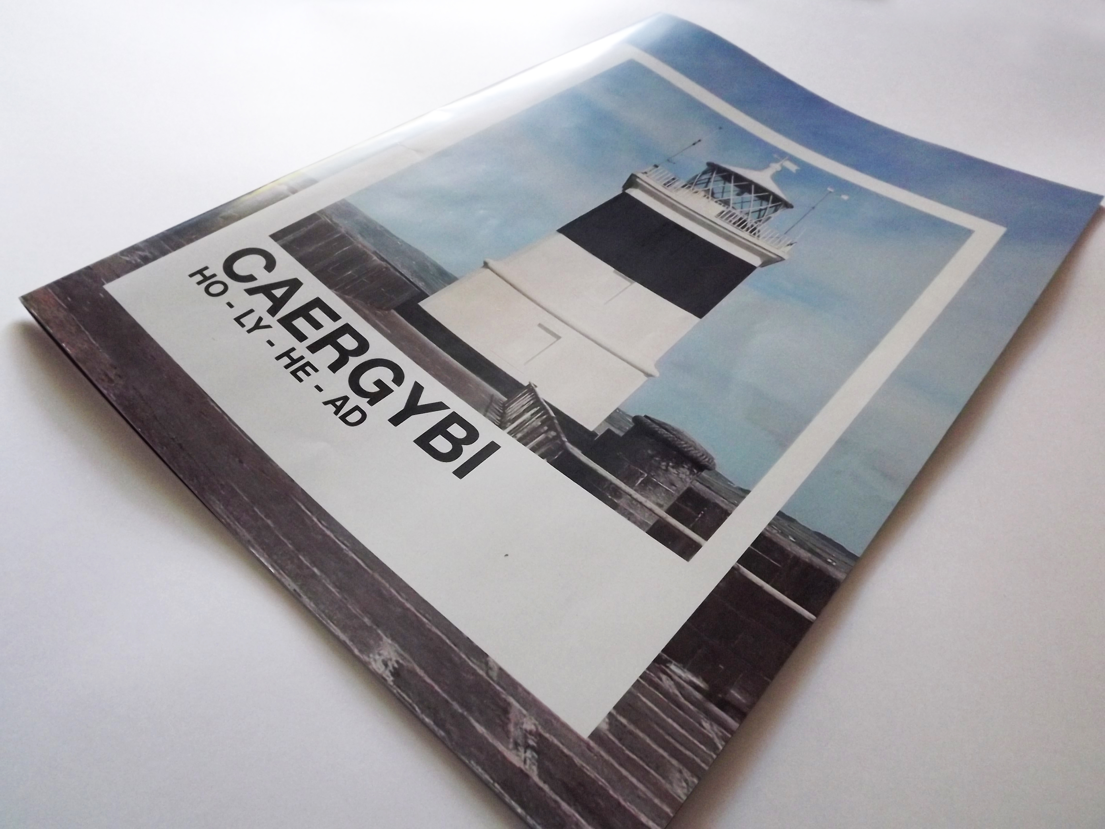
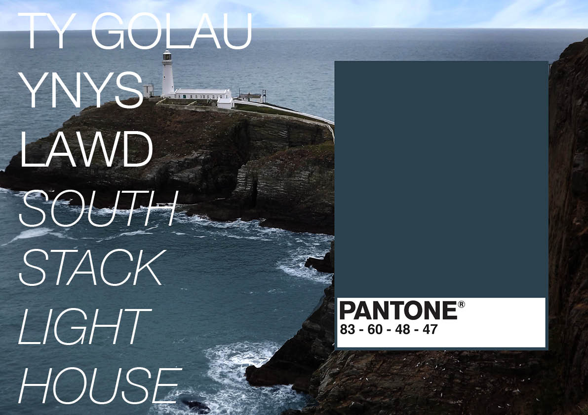
22. 02. 2015
Carrying on with editing today! I’ve started to put all of the pages into an Indesign booklet so to keep on top of everything. I needed an image for the first page of the booklet, to accompany the logo that I had created, so I decided upon South Stack Lighthouse, because I hadn’t used it within the booklet yet.


left: before // right: after
I chose this image, but it needed a lot of editing to bring it up to the standards I wanted. So using the clone tool again, I managed to sort the black paint out on the lighthouse as well as smoothing out the texture of the white areas.
I then used the colour replacement tool and painted over the railing on the right to get rid of the rust colour that was so prominent in the original image. Once that was completed I then used the clone tool again to work on the flooring. I needed to remove the thick dark line as well as the this white line that ran along the floor because they were both very eye catching and ugly.
I also cropped the image to make it portrait so that it would fit nicely into the space I needed it for. I am very happy with this image after editing it.
——————————————————————————————————————————————–
After a lot of editing and going back and forth with design, I finally finished the design of the booklet. I then started emailing various local print companies to compare prices for print.
As I only needed this booklet for my assessment, I only wanted one or two copies. One company said that they wouldn’t print such a small number, another company referred me to the first who wouldn’t print it, and finally I found a company that were nice enough to print my booklet for me!

Cover // Back


——————————————————————————————————————————————–
This is my finished booklet!! I am very happy with it. When I went to pick the booklet up, someone that worked at the printers complimented me on my design, which was very nice of them!